Visualization
Data Notes
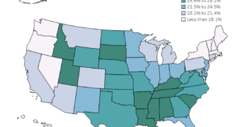
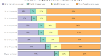
The General Social Survey has been publishing a vast array of data since the 1970s. I decided I wanted to create a visualization that shows how many Americans believe in God. Since everything seems to be about politics recently, I decided to make it a little more interesting by adding a filter that lets you see the results by political party preference. I used the GSS Explorer website to download the 2016 data they have on the subject. Once I had the data, I used Tableau to create the visualization.
If you want to keep up with our surveys and data analysis, be sure to follow us on Twitter and Facebook.
What Percentage of Americans Believe in God? #dataviz https://t.co/K4Bdni1CiM pic.twitter.com/3InDd9vyJG
— Overflow Data (@overflow_data) November 7, 2018


