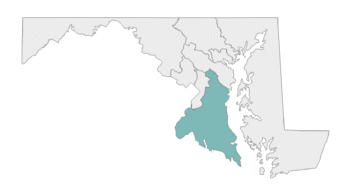
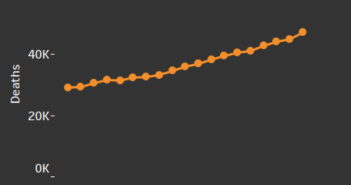
Welcome to our visual exploration of the elderly population in each congressional districts. We’ve gathered information from the 2021 American Community Survey to show the ages of people living in each district. With this tool, you can see if the idea that older people vote for Republicans and younger people vote for Democrats is true. Take a look and compare the different districts to see their age differences. This is a great tool for anyone who wants to understand more about the makeup of our country’s congressional districts.
Data Notes
The data for this visualization was obtained from the U.S. Census Bureau’s FTP site. The data source is the 2021 American Community Survey 1-year estimates. The data was processed using Python/Spyder, and the shapefiles were modified using QGIS. Finally, Tableau was used to create and host this visualization.


