
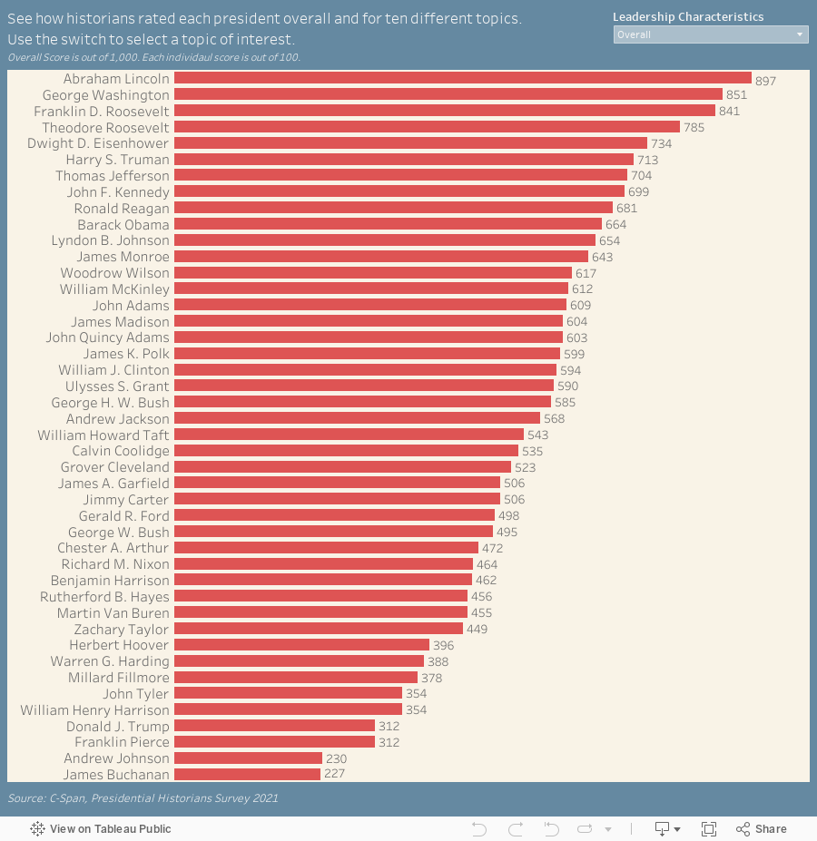
C-Span regularly publishes a survey that asks historians to grade the performance of past presidents. After reviewing the information I decided I wanted to make a data visualization out of it. I organized the results into Google Sheets and then connected the sheet to Tableau Public to create this visualization to celebrate President’s Day.
Follow @overflow_data on X, Instagram, or sign up to recieve emails about our newest visualizations.