
Visualization
Data Notes
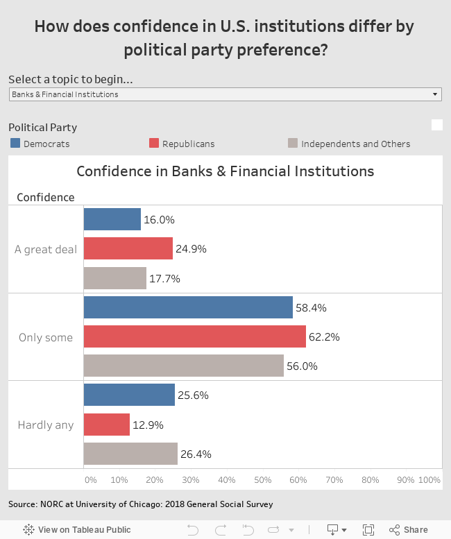
The General Social Survey has been publishing a vast array of data since the 1970s. I decided I wanted to use some of that data to create a visualization that shows how confidence in U.S. institutions differs by political party preference. I used the GSS Explorer website to download the 2018 data they have on the subject. Once I had the data, I used Tableau to create the visualization.
If you want to keep up with our surveys and data analysis, be sure to follow us on Twitter and Facebook.
How does confidence in U.S. institutions differ by political party preference? #dataviz https://t.co/LTc5rqEVHQ pic.twitter.com/t6l7Bm3mw8
— Overflow Data (@overflow_data) November 2, 2018
Leave a Reply