Are People More Likely to Rent or Own their Homes in Each State?
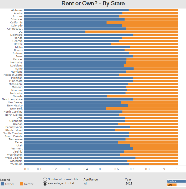
This visualization looks at how the number of households that people rent or buy differs by state.
This visualization looks at how the number of households that people rent or buy differs by state.
This visualization looks at how the number of households that people rent or buy differs by state.
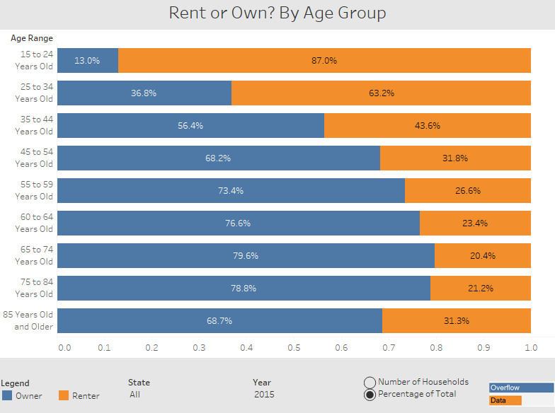
This visualization looks at how the decision to rent or buy may have something to do with age.
This visualization looks at how the decision to rent or buy may have something to do with age.
Copyright © 2026 | WordPress Theme by MH Themes