Overflow Data

A data visualization portfolio for the world.

  • Home
  • State Data Explorer
  • County Data Explorer
  • County Level Analysis
  • Politics
  • About Us
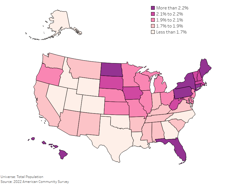
A U.S. map color-coded by county, showing the percentage of the population that is 85 and older in each area. Darker shades indicate higher rates of uninsured individuals, with specific regions in the Florida and New England have the highest concentrations.

Aging in America: State-by-State Analysis of Aging Population

August 30, 2024 Chase 0

As America continues to shift demographically, the aging population has become a much larger focus for policy makers. Understanding where the oldest Americans live, and […]

U.S. Military Deaths Since 2001

May 27, 2024 Chase 0

This Memorial Day, we wanted to honor those that have paid the ultimate sacrifice. To do that, we created this visualization. It pays tribute to […]

U.S. map showing the percentage of adults behind on rent or mortgage payments by state, 2024 data.

What States Have the Most Adults that are Behind on Their Rent or Mortgage?

May 15, 2024 Chase 0

Introduction Understanding where the most people are falling behind on their rent or mortgage is a key part of grasping the bigger picture of housing […]

What States Have the Most Adults Attending Church Once a Month?

April 27, 2024 Chase 1

In Q1 of 2024, 24% of adults attended church monthly in the US. This tool shows how that varies state. States such as Utah lead the way.

Posts pagination

« 1 … 6 7 8 … 153 »

Categories

Copyright © 2026 | WordPress Theme by MH Themes