
Access to technology is essential in today’s digital age, shaping how households connect to education, work opportunities, and healthcare. For example, households in rural areas with reliable broadband can access remote learning programs and telemedicine services, reducing barriers to education and healthcare access. Similarly, high-speed internet enables job seekers in under-connected areas to participate in online job applications and remote work opportunities. This interactive visualization dives into county-level data across the United States, highlighting which areas have the highest percentages of households equipped with smartphones, computers, and high-speed internet.
A Snapshot of the Digital Divide
The map showcases the percentage of households with broadband internet access, desktop or laptop computers, and smartphones. Counties with darker shades represent higher levels of access, while lighter shades indicate areas where fewer households have these essential digital tools.
Urban vs. Rural Trends
Urban areas consistently demonstrate higher levels of access to broadband and devices, driven by infrastructure investments and population density. Conversely, rural counties, particularly in the Midwest and South, reveal gaps in access, underscoring the challenges of bridging the digital divide.Implications for Policy and Community Development
Understanding where households lack access is vital for crafting policies that expand digital access and improve connectivity across underserved regions. The data underscores the need for targeted investment in broadband infrastructure and digital literacy programs, particularly in underserved areas.
Explore the Data
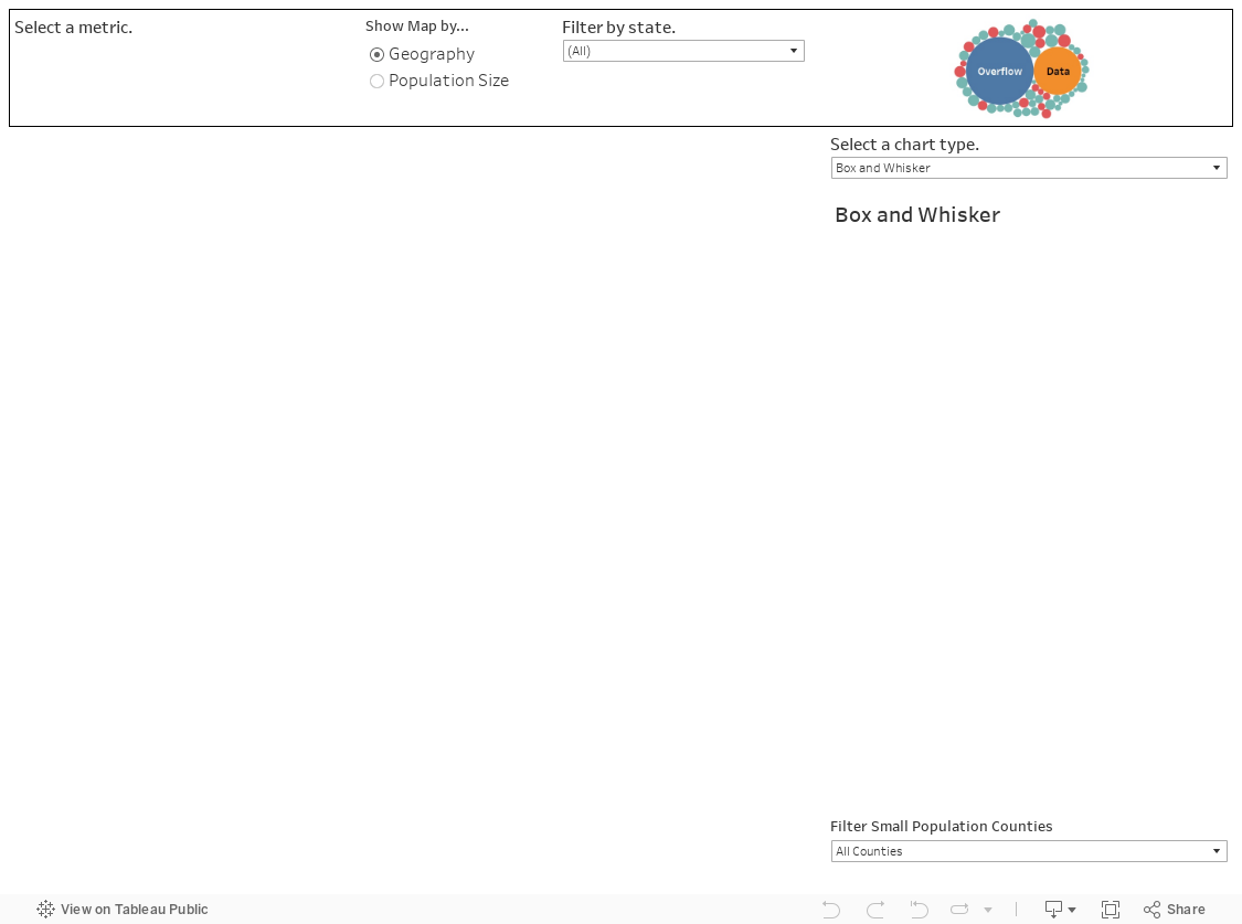
Use this visualization to:
- Compare counties by geography or population size.
- Filter data by state for a closer view of regional trends.
- Identify areas where increased investment in digital access could make the biggest impact.
By analyzing household access to technology, this visualization offers valuable insights for policymakers, educators, and community leaders aiming to build a more connected future.
Data Sources
This data tool uses data provided by the U.S. Census Bureau 2023 5-year American Community Survey Estimates to ensure accuracy and comprehensiveness. The visualization is powered by Tableau Public. If you are intersted in more county level data visualizations, check out our County Data Explorer.
Leave a Reply