
Demographic Snapshot: Eaton Fire Perimeter
Explore population data within the Eaton Fire perimeter. View demographic insights, fire impact statistics, and updates on containment.
Explore population data within the Eaton Fire perimeter. View demographic insights, fire impact statistics, and updates on containment.
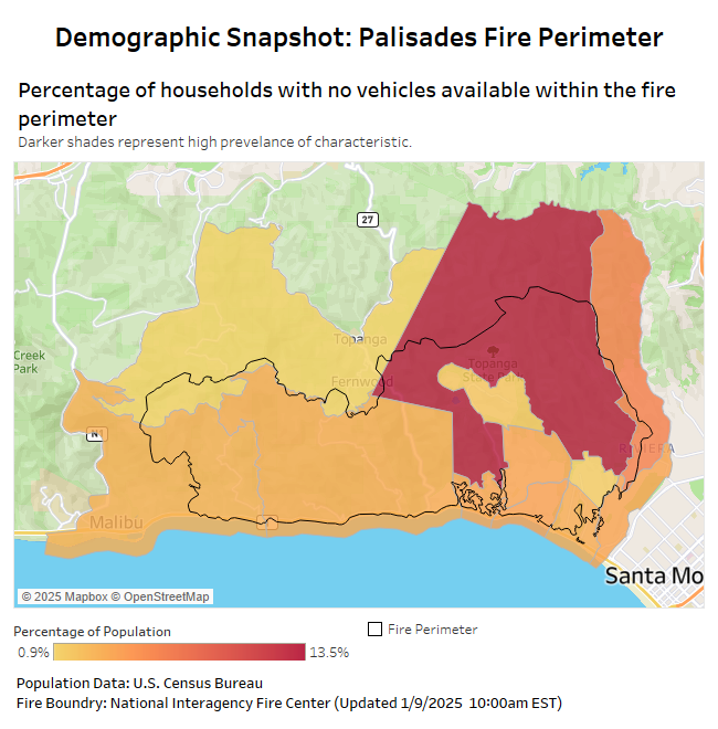
Explore population data within the Palisades Fire perimeter. View demographic insights, fire impact statistics, and updates on containment.

A look at broadband internet access in each state in the U.S.
As America continues to shift demographically, the aging population has become a much larger focus for policy makers. Understanding where the oldest Americans live, and […]
Copyright © 2026 | WordPress Theme by MH Themes