
Congressional District Ranker
Compare U.S. congressional districts by key indicators like poverty, income, education, and more. Filter, sort, and uncover patterns that matter.
Compare U.S. congressional districts by key indicators like poverty, income, education, and more. Filter, sort, and uncover patterns that matter.
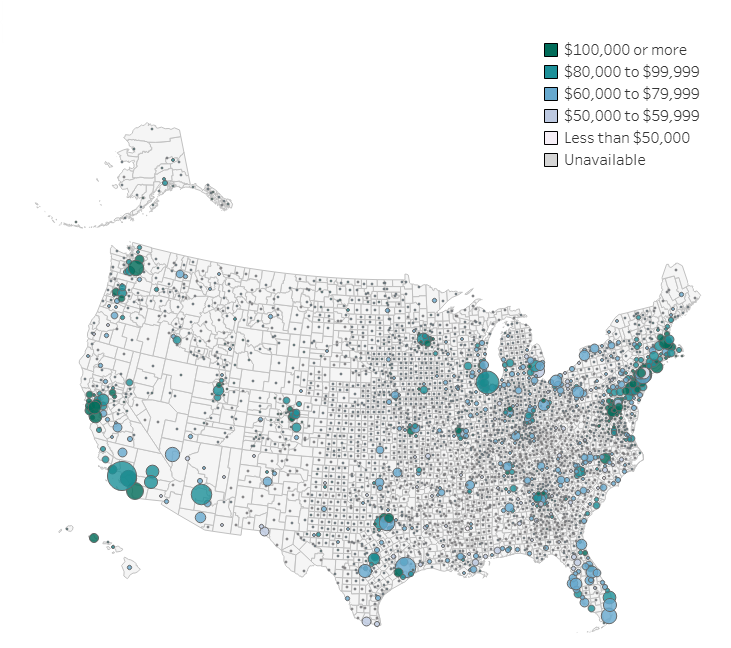
Learn from our data visualization how income and inequality varies across the 3,143 counties in the United States.
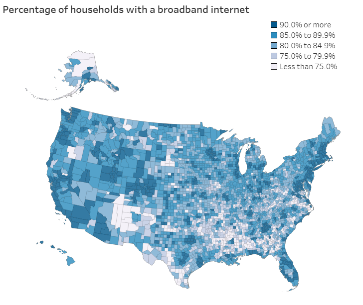
Access to technology is essential in today’s digital age, shaping how households connect to education, work opportunities, and healthcare. For example, households in rural areas […]
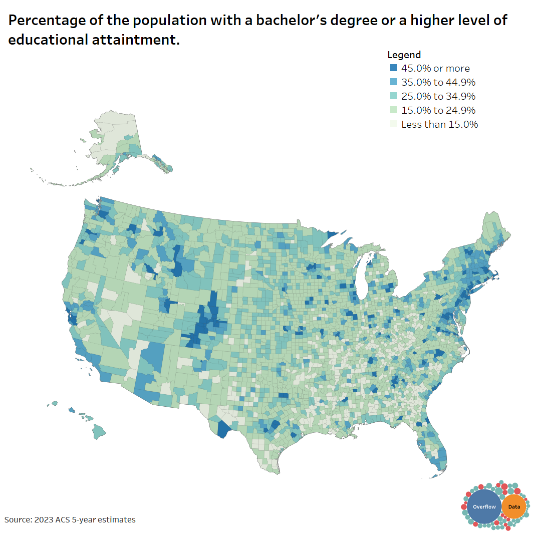
The word, “educated” means different things to people. This visual shows how educated people are in each county for different benchmarks.
Copyright © 2026 | WordPress Theme by MH Themes