Introduction
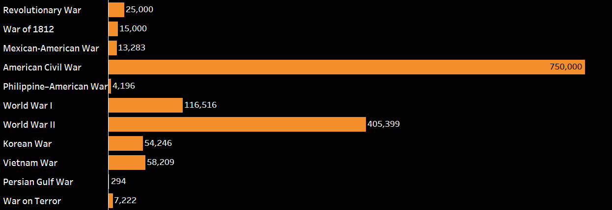
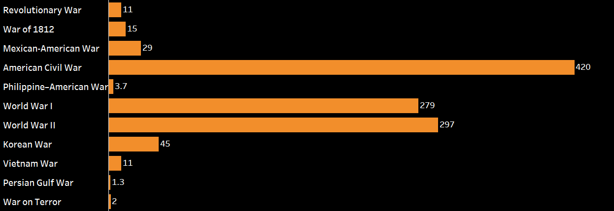
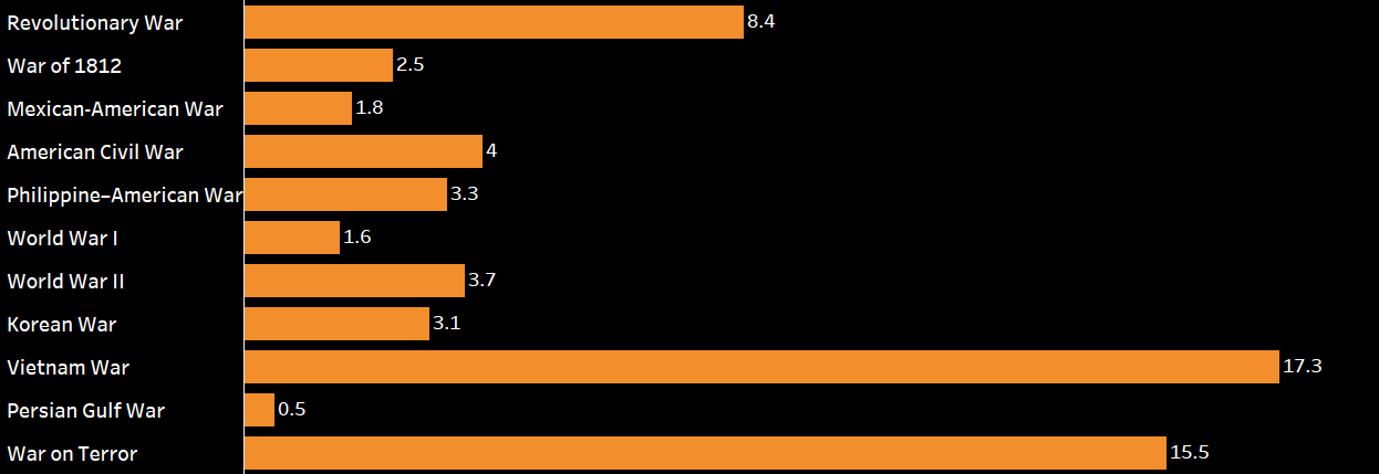
This Memorial Day, I wanted to create a visualization that memorializes more than 1.35 million that have lost their lives in order to protect America. The visualization below has a timeline and bar chart view that shows the number of deaths in each war, deaths per day, deaths as a percentage of the population, and the length of each war.
Visualization
[accordions]
[accordion title=”Timeline” load=”show”]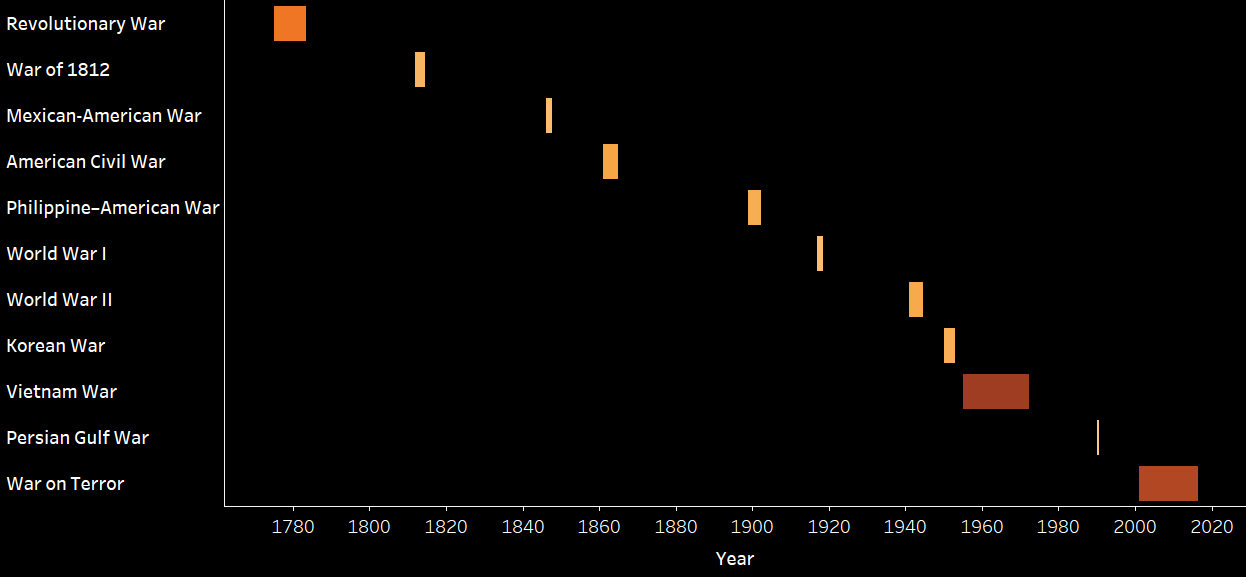
[/accordion]
[accordion title=”Deaths” load=”hide”]
[/accordion]
[accordion title=”Deaths per Day” load=”hide”]
[/accordion]
[accordion title=”Deaths per Population” load=”hide”]

[/accordion]
[accordion title=”Length (Years)” load=”hide”]
 [/accordion]
[/accordions]
Data Notes
The data for this visualization is from a compilation of sources and was found on Wikipedia. The article is named “United States military casualties of war”. If you are interested in viewing the article you can find it here.
Once I gathered the data, I edited it in Excel and created the visualization in Tableau.
If you want to keep up with our surveys and data analysis, be sure to follow us on Twitter and Facebook.
How long was the U.S. involved in various wars? #dataviz #MemorialDay https://t.co/vstvZwmyum pic.twitter.com/0kq78jIkO7
— Overflow Data (@overflow_data) May 29, 2017
