
What are the Most Conservative and Liberal Cities in the US? – Gallery
Visualization Source I originally found this data in a Forbes article. I did a little research on their methodology and found that they had taken […]
Visualization Source I originally found this data in a Forbes article. I did a little research on their methodology and found that they had taken […]
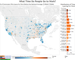
Introduction Ever wonder how early other Americans leave for work? Data from the US Census Bureau shows that most Americans leave for work between 7:00 […]
Introduction Earlier at the beginning of the season we did a visualization that let you make sure you drafted the best players. Now we wanted […]
Introduction We love comparing counties and states so we made a tool that lets you do it with the level of educational attainment. Below you […]
Copyright © 2026 | WordPress Theme by MH Themes