Overflow Data

A data visualization portfolio for the world.

  • Home
  • State Data Explorer
  • County Data Explorer
  • County Level Analysis
  • Politics
  • About Us

Demographic Traits

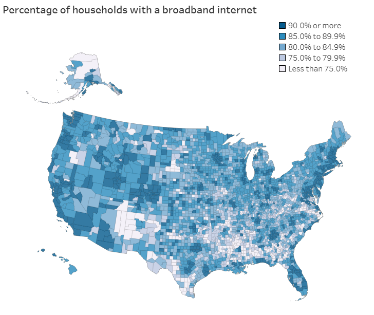
U.S. map displaying county-level broadband internet access as a percentage of households. Counties are shaded in varying intensities of blue, with darker shades representing higher access levels (90% or more) and lighter shades indicating lower access levels (less than 75%). A legend categorizes the access percentages into five ranges. The visualization highlights disparities in broadband access across the country, with accompanying data on the top counties for household broadband availability.

Top U.S. Counties for Household Access to Internet, Smartphones, and Computers

January 20, 2025 Chase 0

Access to technology is essential in today’s digital age, shaping how households connect to education, work opportunities, and healthcare. For example, households in rural areas […]
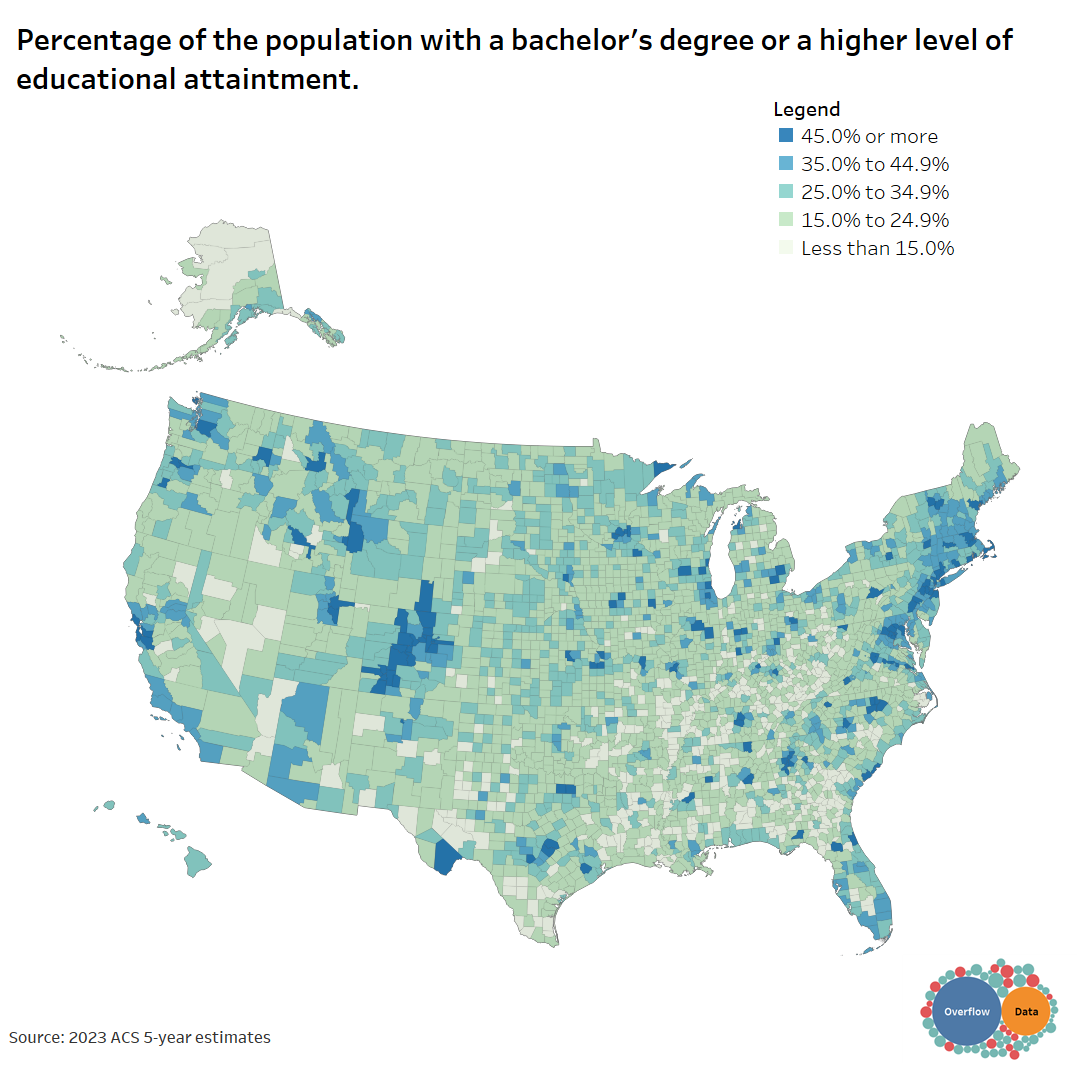
What Counties in the U.S. Are the Most Educated in 2023?

January 14, 2025 Chase 0

The word, “educated” means different things to people. This visual shows how educated people are in each county for different benchmarks.

The State of Connectivity: Broadband Access by State

December 4, 2024 Chase 0

A look at broadband internet access in each state in the U.S.

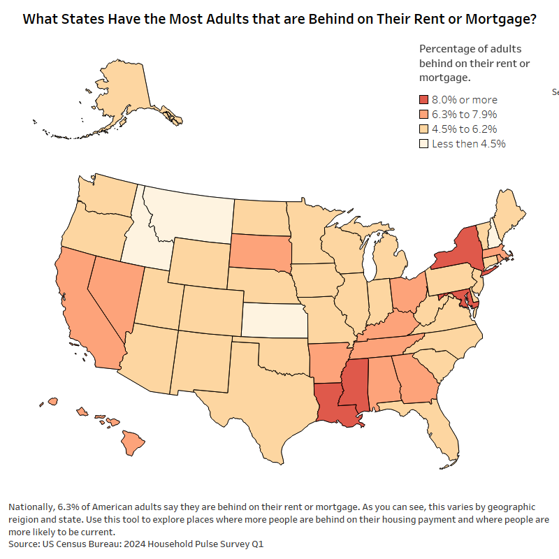
U.S. map showing the percentage of adults behind on rent or mortgage payments by state, 2024 data.

What States Have the Most Adults that are Behind on Their Rent or Mortgage?

May 15, 2024 Chase 0

Introduction Understanding where the most people are falling behind on their rent or mortgage is a key part of grasping the bigger picture of housing […]

Posts pagination

« 1 2 3 4 … 45 »

Categories

Copyright © 2026 | WordPress Theme by MH Themes