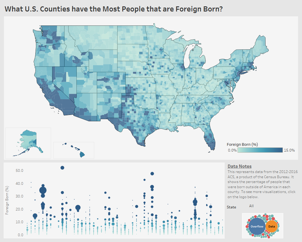
What U.S. Counties have the Most People that are Foreign Born?
This visualization shows the percentage of the population that was born in another country in each U.S. county.
This visualization shows the percentage of the population that was born in another country in each U.S. county.

This data visualization provides a look at how the marital status of Americans can differ with age.
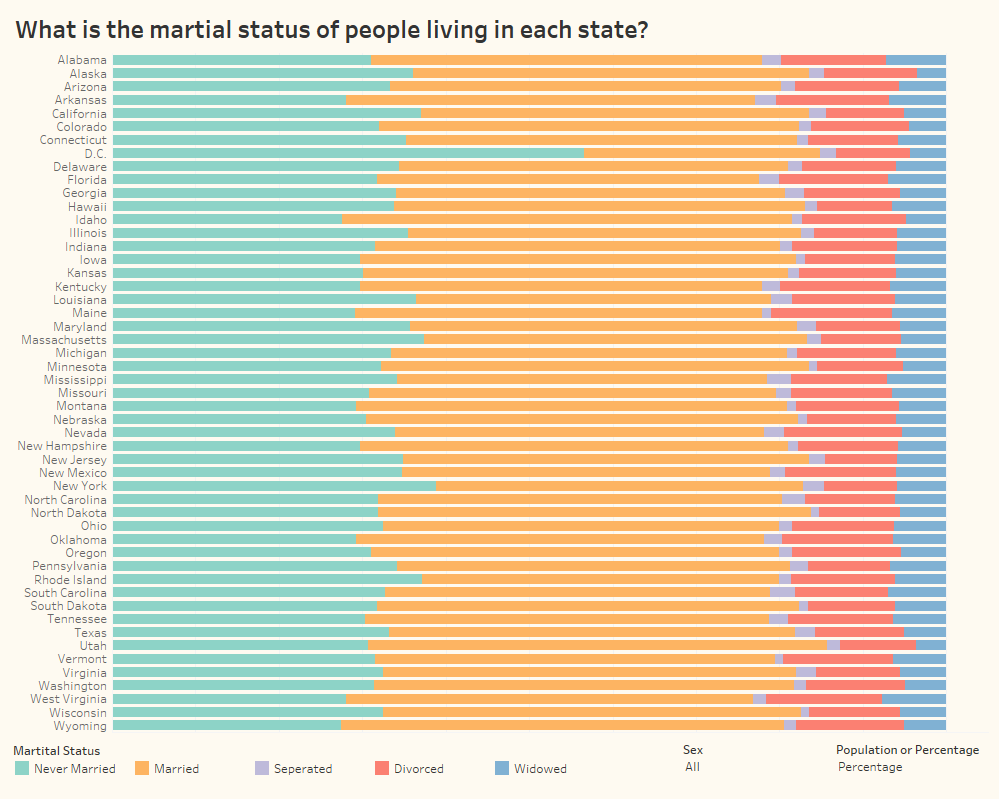
A graphical look at how marital status differed in each state in 2016.

Some data visualization highlighting outcomes, MVP winners, attendance, and
Copyright © 2026 | WordPress Theme by MH Themes