How Many People in the US Commit Suicide Each Year?
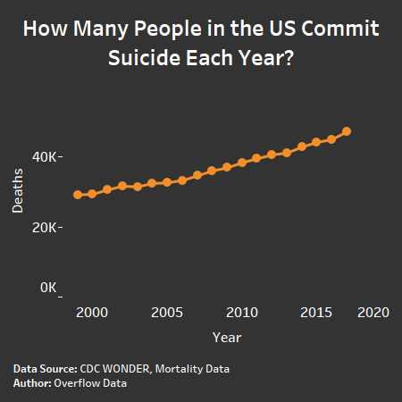
In America, for every 7,000 people, one person committs suicide yearky. This data viz explores how suicides are becoming more prevalent in the United States.
In America, for every 7,000 people, one person committs suicide yearky. This data viz explores how suicides are becoming more prevalent in the United States.

This winter, we are pairing weather data and population data. This helps you understand to how many people are currently being impacted by winter weather. […]
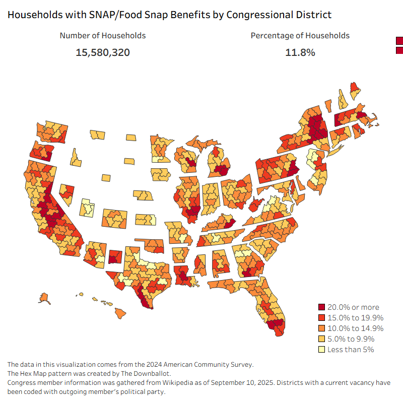
Explore how many U.S. households rely on SNAP in each congressional district and see who may be affected by the 2025 government shutdown.
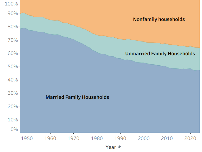
Explore how American household types have shifted since the 1940s using data. See trends in married, unmarried, and nonfamily households.
Copyright © 2026 | WordPress Theme by MH Themes