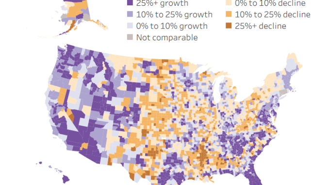
Between 2000 and 2025, the population of the United States increased by nearly 60 million people.
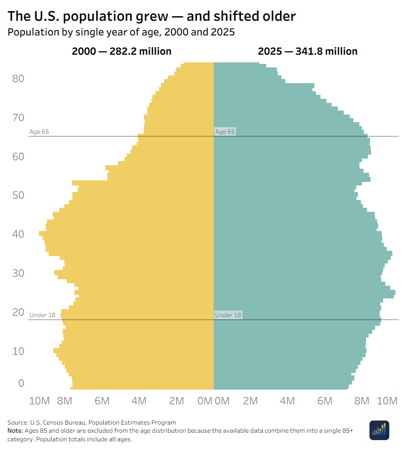
At the national level, this is a straightforward story of growth. The U.S. population rose from 282.2 million to 341.8 million, a 21% increase. But the national total hides two different maps of population change.
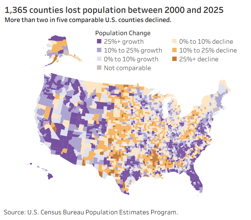
Growth was concentrated. A small group of states and counties accounted for a large share of the country’s population increase, while almost half of counties lost population.
Aging was much more widespread. The national median age increased, the share of children declined, and the share of people age 65 or older rose in almost every comparable county from 2010 to 2025.
These patterns are related to the same population, but they are not interchangeable. A place’s growth rate tells us surprisingly little about how its age structure changed.
National growth was concentrated
Over the last 25 years, 49 states and the District of Columbia gained population. West Virginia was the only state with a lower population in 2025 than in 2000.
That makes population loss appear rare. It was not.
Among the nation’s more than 3,000 counties, 1,365 lost population. That is about 40% of counties.
State totals can therefore conceal very different changes within their borders. A state may grow because a relatively small number of counties added enough residents to offset losses elsewhere. A national increase can work the same way.
Texas added 10.8 million people, more than any other state. Florida added 7.4 million, followed by California with 5.4 million. Together with North Carolina and Georgia, those five states accounted for about half of the entire national population increase.
The county pattern was even more concentrated. Harris County, Texas, and Maricopa County, Arizona, each added about 1.6 million people. Clark County, Nevada, and Riverside County, California, each added about 1 million.
These numbers do not make the fastest-growing places the country’s most successful communities. Growth may reflect many forces, including births, deaths, domestic and international migration, housing availability, jobs and public policy. The population totals describe what changed. They do not, by themselves, explain why.
Aging reached almost everywhere
While growth and decline divided counties, aging was nearly universal.
The national median age rose from 35.4 in 2000 to 39.4 in 2025. The share of the population under age 18 fell from 25.7% to 21.1%. Over the same period, the share age 65 or older rose from 12.4% to 18.9%.
County age estimates in our THRIVE data series begin in 2010, so the county comparison covers a shorter period. Even so, the reach of the change is clear. From 2010 to 2025, the share of residents age 65 or older increased in more than 99% of counties.
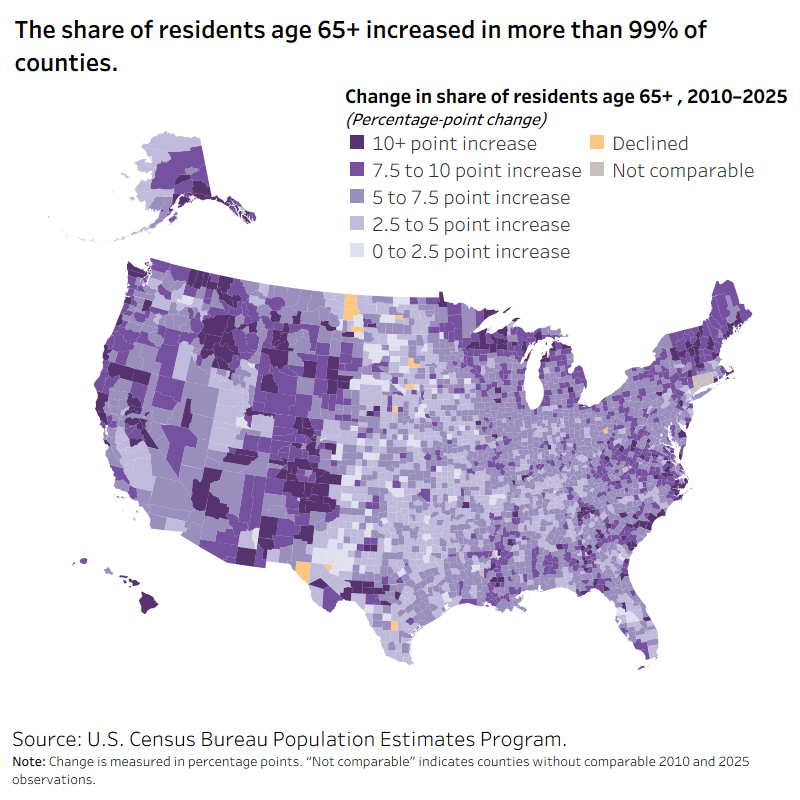
Median age also increased in about 85% of counties.
These measures describe different parts of the same change. Median age identifies the midpoint of the population. The age-65-plus share shows how much of the population is in an older age group. The share under 18 describes the younger population. None should be used as a substitute for the others.
And none is a verdict on a community. An older population is not inherently worse, just as a younger population is not inherently better.
Fast growth does not mean the same age profile
It would be easy to assume that fast-growing places are young and shrinking places are old. The data do not support that simple division.
Florida and Utah were both among the fastest-growing states between 2000 and 2025. Florida’s population increased 46%, while Utah’s increased 58%.
Their age profiles were very different. Florida’s median age was 43.1 in 2025, and 22.8% of its population was age 65 or older. Utah had the lowest median age among the states and DC at 32.6, and 13.0% of its population was 65 or older.
Both states grew quickly. Both also aged. But they did not arrive at the same population structure.
The same contrast appears among slower-growing and declining states. Maine grew about 11% and had the country’s highest median age in 2025 at 44.9. West Virginia lost about 2% of its population and had a median age of 43.2.
Across all states and DC, population percentage growth had almost no linear relationship with the change in median age. The same was true at the county level from 2010 to 2025. Growth and aging were not opposite ends of one scale. They were different dimensions of population change.
That distinction is important because a growth ranking cannot tell communities what age groups they are gaining, losing or serving.
Why these changes matter
Population totals and age structure help establish the context in which governments and communities make decisions.
Age composition is one factor agencies use when planning services because different life stages can have different needs. A community with a growing number and share of older residents may face different questions about transportation, health, housing and supportive services than a community with a larger share of children. The federal Administration for Community Living, for example, directs aging-services planners to consider how changes in older populations may affect the need for supportive services.
But the population data in this story do not measure demand for those services. Age does not reveal a person’s health, income, preferences or needs. It gives planners one part of the picture.
Where population growth occurs also matters for political representation. Population counts from the decennial census are used to divide seats in the U.S. House of Representatives among the states, and redistricting responds to population shifts within states. That relationship is the central purpose of the decennial census.
The annual population estimates used in this analysis are not apportionment counts, however. They should not be used here to declare which states will gain or lose House seats after the 2030 Census. Nor do population and age estimates tell us how people will vote.
Population change is context, not a score
The United States was larger in 2025 than it was in 2000. But “larger” is only the beginning of the story.
Growth accumulated in a limited number of places even as many counties lost population. Aging, by contrast, reached nearly every part of the country. And communities that followed similar growth paths could have very different age structures.
This is why population growth should not be treated as another ranking of which places are winning and losing. A growing population may create opportunities and pressures. A shrinking population may create a different set of choices. Neither tells us whether people have access to good lives, but it helps to guide the discussion on what will lead to happiness within a community.
At Overflow Data, our goal is to use data to better understand the conditions shaping American communities. Population is one of those conditions. Looking at how many people live in a place—and who makes up that population—gives us a clearer view of how the country is changing and what questions communities may need to ask next.
About the data
This analysis uses data from our THRIVE population series, built from the U.S. Census Bureau’s Population Estimates Program.
National and state comparisons cover 2000–2025. County population comparisons include counties and county equivalents with the same source GEOID at both endpoints. County age comparisons cover 2010–2025 because governed county age measures are not available before 2010.
THRIVE retains source-native geography and does not silently remap historical counties to current boundaries. The analysis excludes Puerto Rico, consistent with the governed release. Figures are rounded in the text; calculations use unrounded values.
Leave a Reply