Introduction
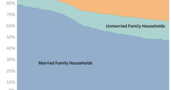
Last week, I published a data visualization that looked at marital status in America. I decided to take this a step further and great a chart similar to some data published by Pew in 2015. This visualization looks at how marital status can differ based on race and ethnicity in America.
Visualization
Data Notes
Source: Tabulated from 2016 1 Year American Community Survey PUMS
Tool: Tableau
If you want to keep up with our surveys and data analysis, be sure to follow us on Twitter and Facebook.
How does marital status differ by race in the U.S.? #dataviz https://t.co/8Sh7vBzxNY pic.twitter.com/Scmtf5KZMH
— Overflow Data (@overflow_data) July 17, 2018


