Visualization
Mobile Users: If you are having issues using the interactive version of this visualization, you can find a static version of it here.
Data Notes
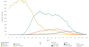
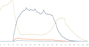
I was interested in visualizing how the highest level of school completed differs based on someone’s age. To do this I gathered data from the American Community Survey which is completed by the US Census Bureau. I used the 2015 One Year Estimates Public Use Microdata Sample, which can be found on the ACS Website. I then used Tableau to visualize the data. If you are interested in more data like this be sure to check out my “How American’s Differ by Age” Data Visualization.
If you want to keep up with our surveys and data analysis, be sure to follow us on Twitter and Facebook.
How Much Education do Americans Have? – Visualized by Age #dataviz https://t.co/mKJom7xBJ9 pic.twitter.com/NhRz590ZEH
— Overflow Data (@overflow_data) November 28, 2016


3 Comments
The visual is pretty flawed because it shows education graphed by population and as people age, they die. It makes sense the oldest on this chart show the smallest bars. The only way to get something of use out of this to hover over the colors and see the data by PERCENTAGE of living members of that age… that IS interesting and shows what you would expect that the oldest Americans DO tend to have less formal education than younger Americans, but it isn’t overwhelming, in many cases only 5-10% less for each category of education.
Has anybody noticed that the K-12 no diploma spikes every 5 years in age? Start with the 25 yo and each 5 year increment in age relates to a spike in numbers
Excellent article, very well written and too the point!