How is the percentage of people living in poverty changing over time?
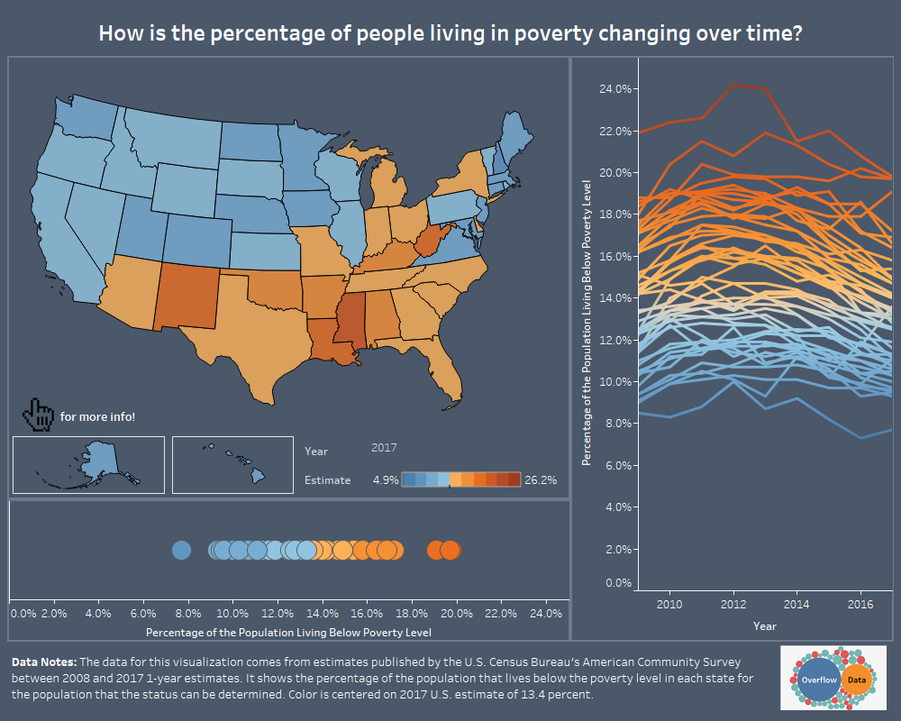
A look at how the number of people in the U.S. living in poverty has changed over the last 10 year.
A look at how the number of people in the U.S. living in poverty has changed over the last 10 year.
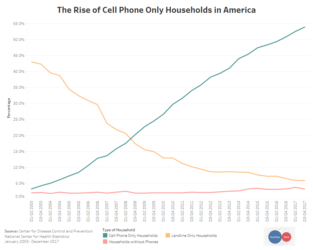
A look at the rise of households that have cell phones, but no landlines over the last 15 years.
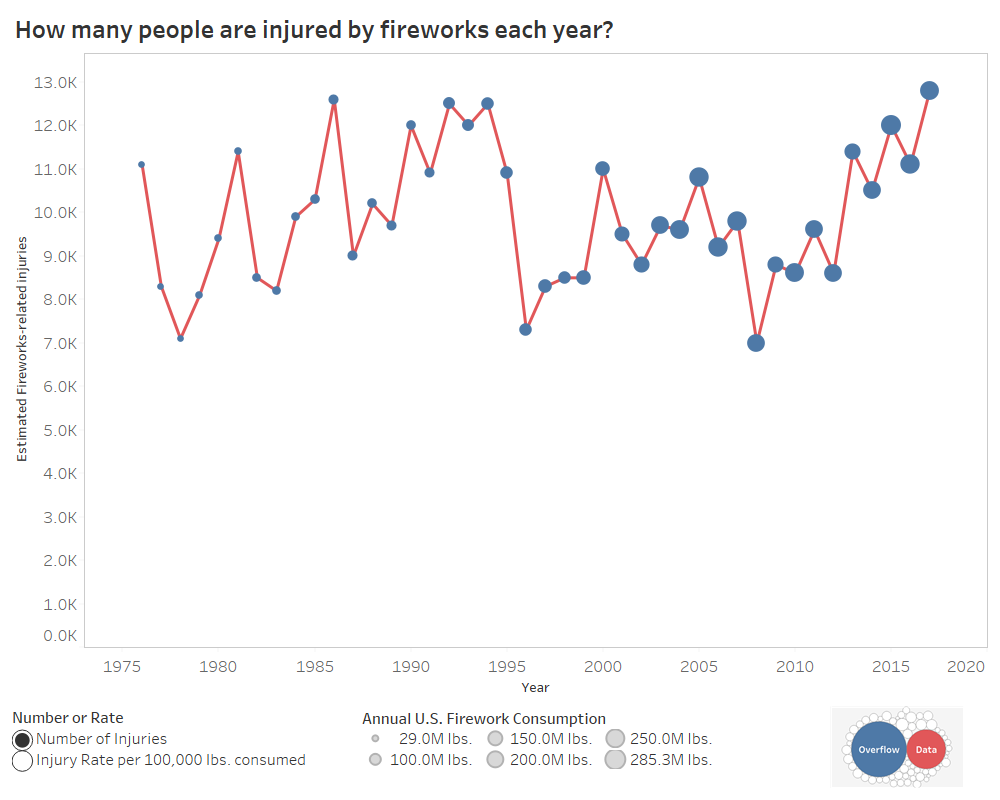
This data visualization provides a look at how many people are injured each year by fireworks in the U.S.
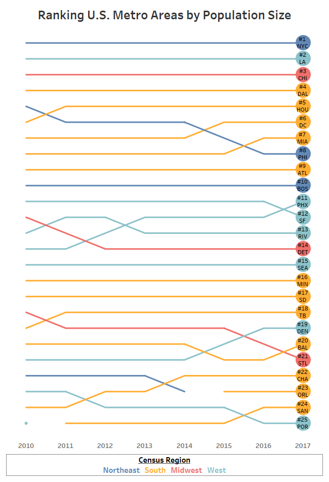
This visualization looks at how metro areas rank in population size within the United States.
Copyright © 2026 | WordPress Theme by MH Themes