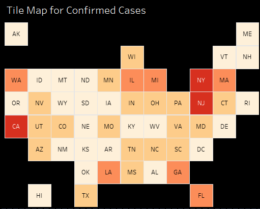
U.S. COVID-19 Dashboard
Need a simple way to find COVID-19 statistics for your state? This interactive dashboard provides easy access to information about each state and the U.S.
Need a simple way to find COVID-19 statistics for your state? This interactive dashboard provides easy access to information about each state and the U.S.
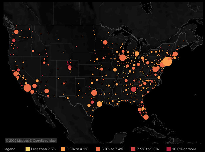
More people are working at home because of COVID-19. This visualization shows what percentage of workers were regularly working at home in 2018.
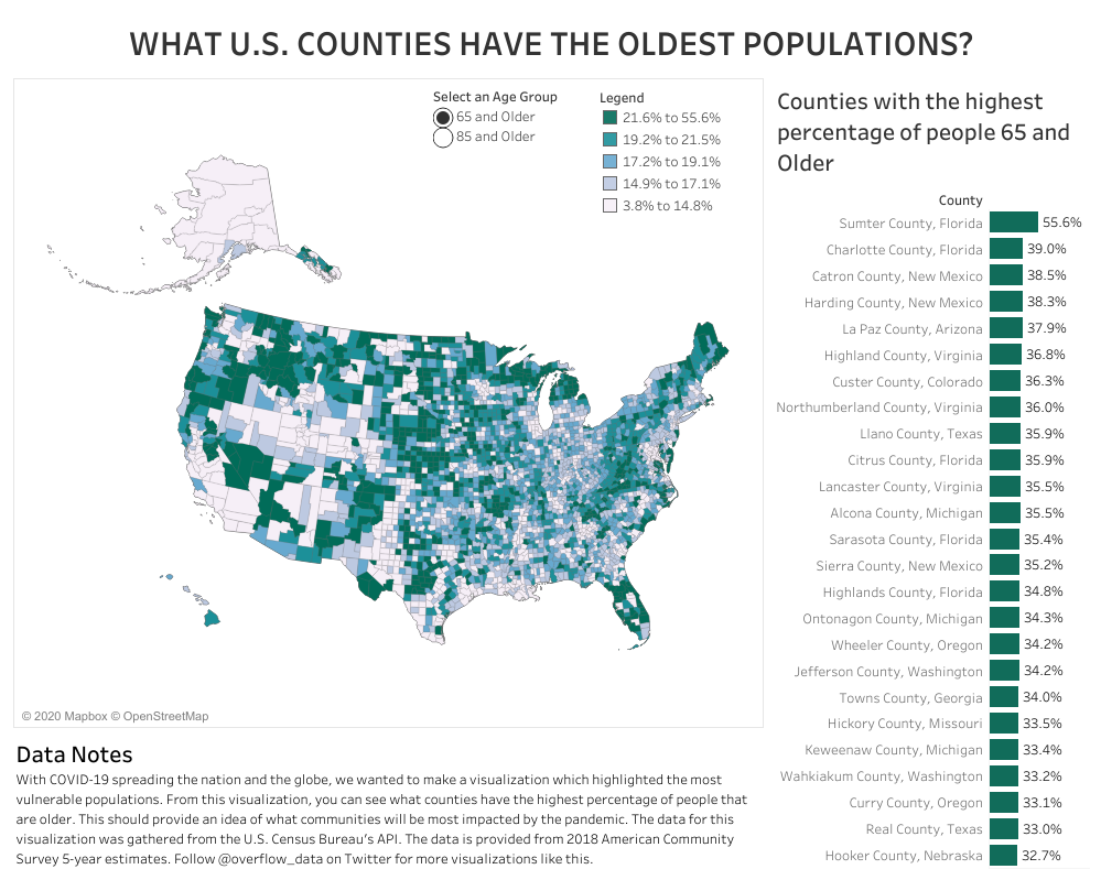
This visualization explores what counties in the U.S. have the highest proportion of people that are 65 and older and 85 and older.
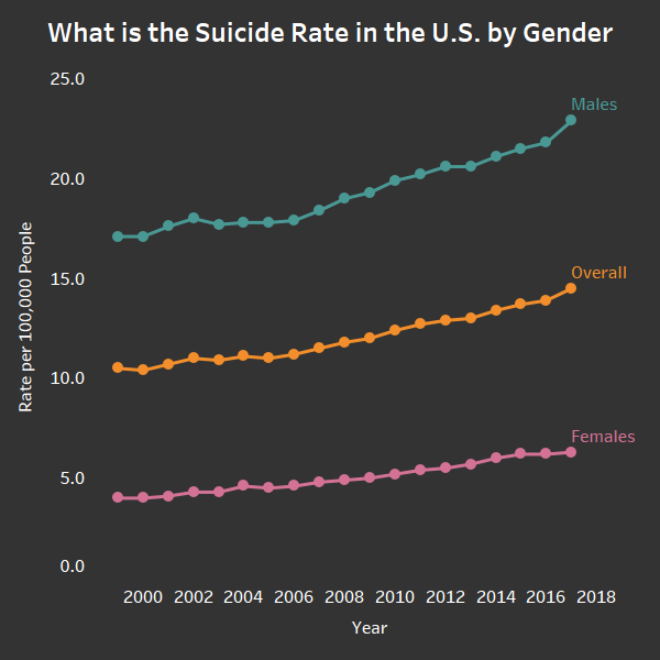
In 2017, for every 7,000 people, one person committed suicide. This data viz explores the rate of suicide for men and woman in the United States.
Copyright © 2026 | WordPress Theme by MH Themes