What Universities are Students Most Eager to Attend?
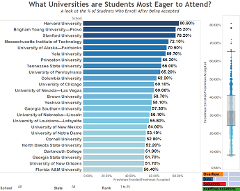
This visualization lets you see what universities have the highest number of accepted students that decided to enroll for the Fall of 2014.
This visualization lets you see what universities have the highest number of accepted students that decided to enroll for the Fall of 2014.

Every wondered what the most used words in the “I Have A Dream Speech” are? Use our word cloud to explore them.

Source I originally found this data in a Forbes article. I did a little research on their methodology and found that they had taken the […]

Want to relive your big fantasy wins these season or figure out where you went wrong? Here is a visual recap of the 2015 Fantasy Football Season.
Copyright © 2026 | WordPress Theme by MH Themes