THRIVE State Economic Conditions Explorer
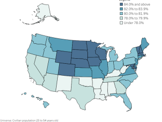
Explore state economic conditions with THRIVE, using labor force participation, prime-age employment, and unemployment data to compare opportunity across states.
Explore state economic conditions with THRIVE, using labor force participation, prime-age employment, and unemployment data to compare opportunity across states.
Explore THRIVE, an Overflow Data project tracking the relationships, vitality, and essentials that help communities prosper and flourish.
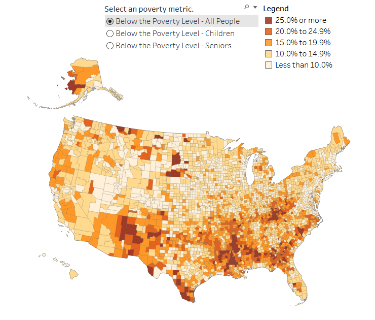
Explore the latest data on poverty in the United States and discover which counties bear the highest poverty rates.
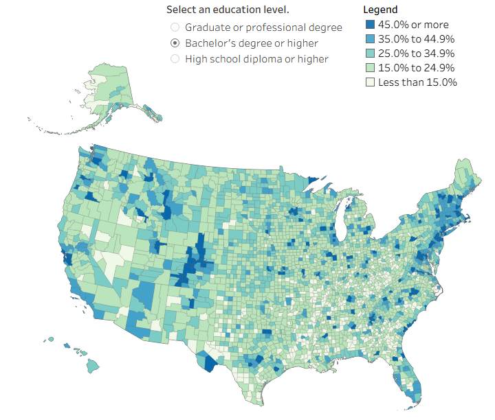
The word, “educated” means different things to people. This visual shows how educated people are in each county for different benchmarks.
Copyright © 2026 | WordPress Theme by MH Themes