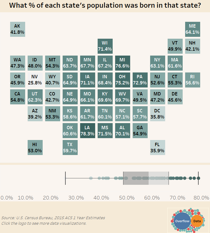
What percentage of each state’s population was born in that state? – Gallery
Visualization Data Notes The data for this visualization comes from the American Community Survey which is conducted by the U.S. Census Bureau. I used the […]
Visualization Data Notes The data for this visualization comes from the American Community Survey which is conducted by the U.S. Census Bureau. I used the […]
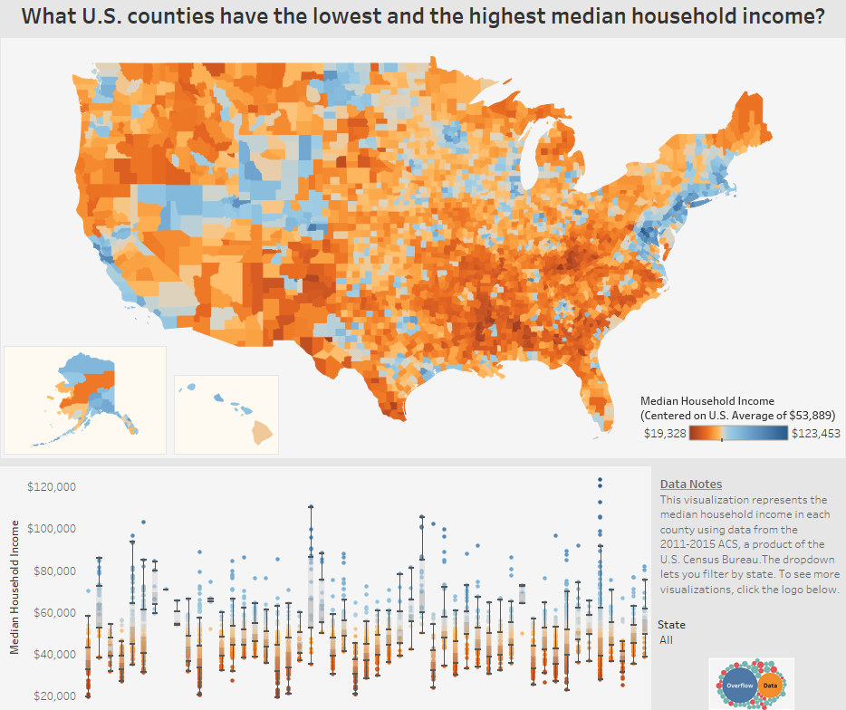
Our gallery view of which counties in the U.S. have the lowest and highest median household income.
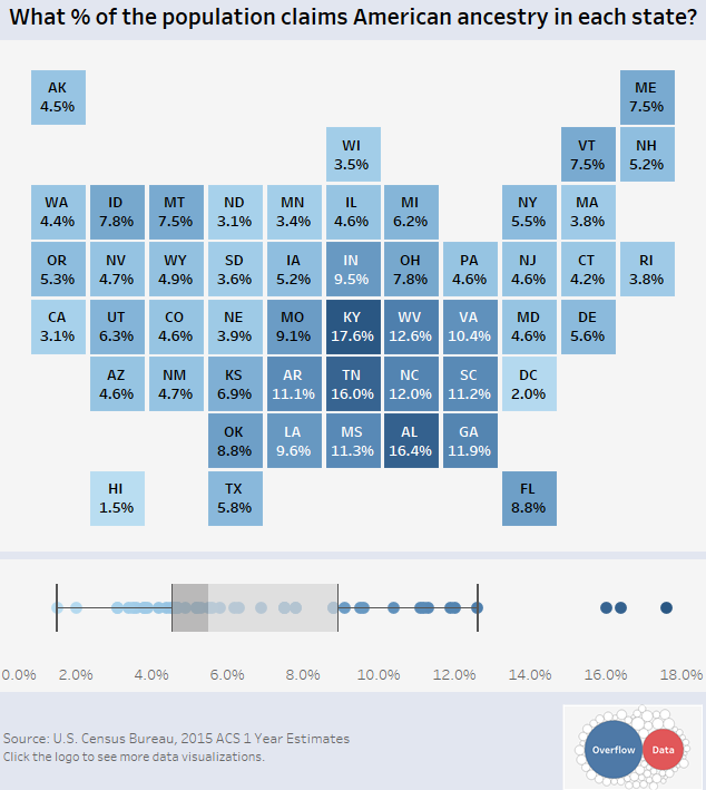
Our gallery view of the number of Americans that say their ancestry is “American” in each state.
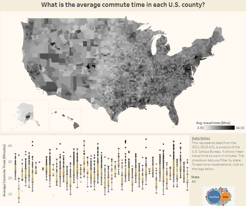
Our gallery view of what the average commute time is in each U.S. county.
Copyright © 2026 | WordPress Theme by MH Themes