How Many Americans Moved in the Last Year? – Visualized by Age – Mobile
Charting the proportion of Americans have recently moved to a different address based on age.
Charting the proportion of Americans have recently moved to a different address based on age.

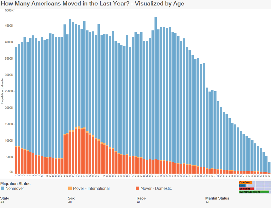
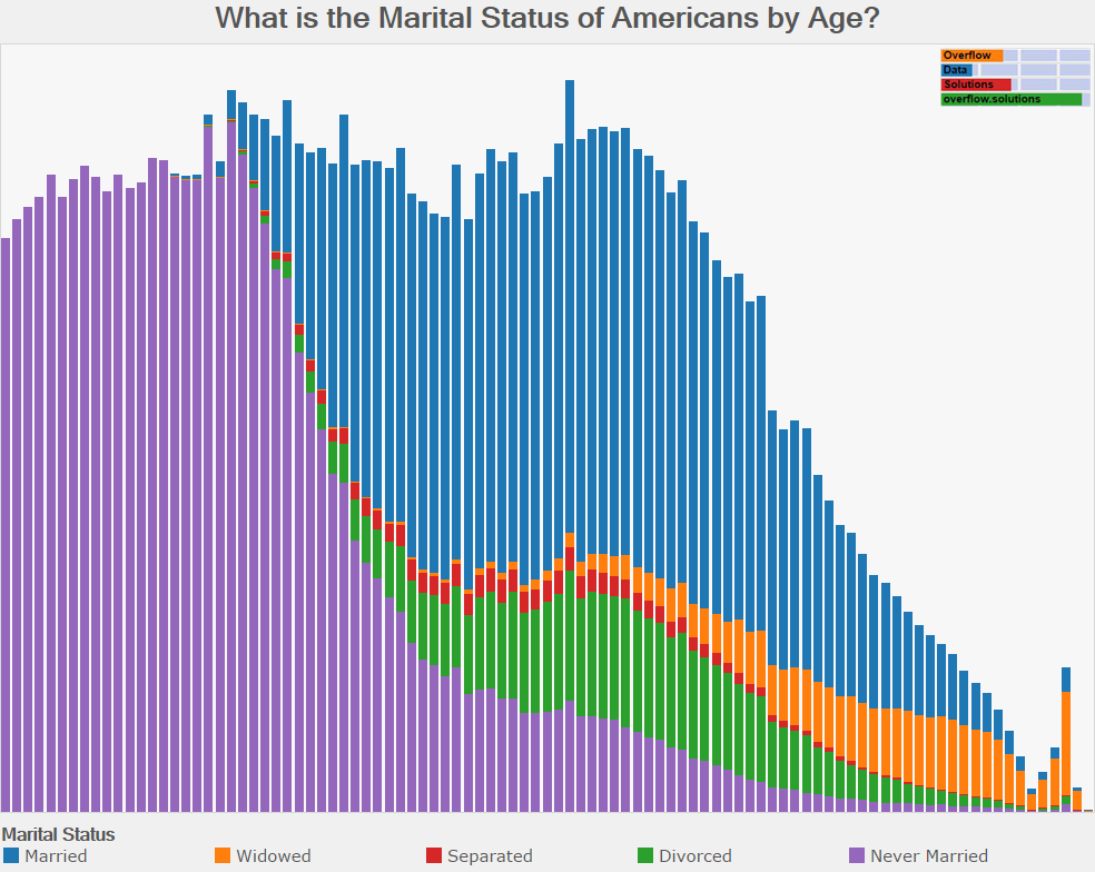
Visualization Data Notes A couple weeks ago, I published a graphic showing how marital status changes with age. I decided to do another one showing […]
Visualization Data Notes A few months ago I created a visualization that allowed users to compare age distributions for various topics and another one that […]
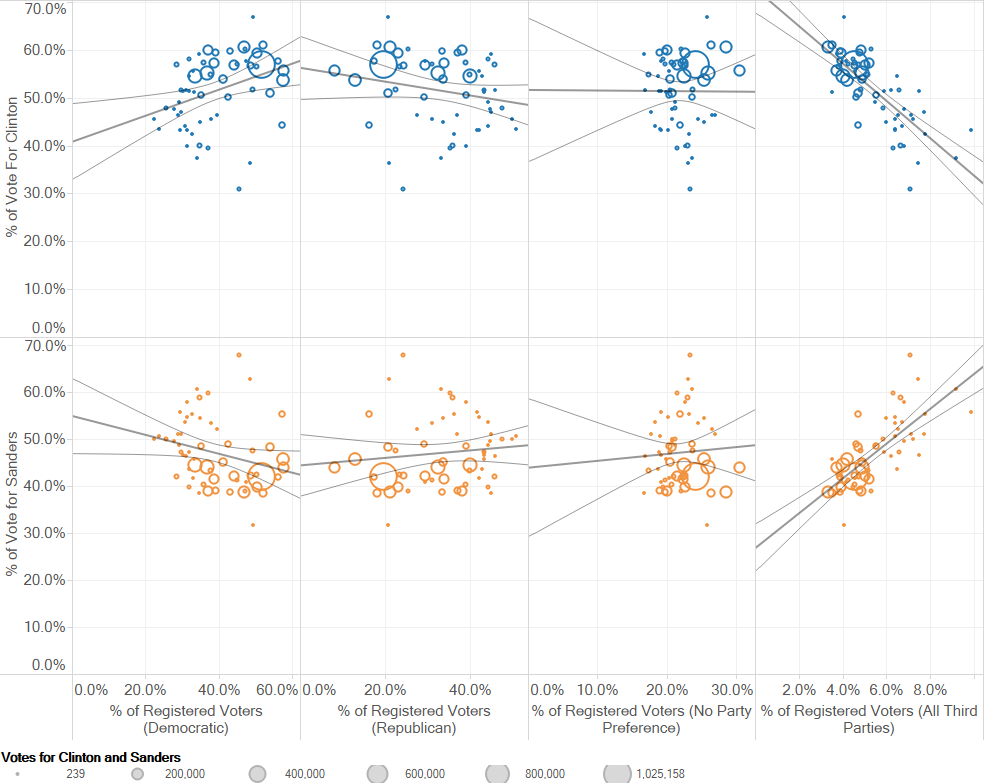
Introduction Earlier in the 2016 presidential primary season, I had heard it posited that Hilary Clinton was doing well in areas that are considered Republican […]
Copyright © 2026 | WordPress Theme by MH Themes