Overflow Data

A data visualization portfolio for the world.

  • Home
  • State Data Explorer
  • County Data Explorer
  • County Level Analysis
  • Politics
  • About Us

National Data

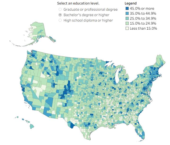
What Counties in the U.S. Are the Most Educated?

February 24, 2026 Chase 0

The word, “educated” means different things to people. This visual shows how educated people are in each county for different benchmarks.
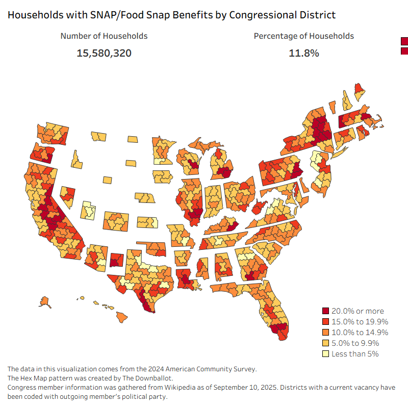
A U.S. hex map showing the percentage of households receiving SNAP or food stamp benefits by congressional district. Dark red districts have 20% or more households receiving benefits, while yellow areas have less than 5%. Nationwide, 11.8% of households—about 15.6 million—receive SNAP assistance. High-dependency districts cluster in the rural South, parts of the Midwest, and major urban centers, while lower rates appear across much of the Midwest and Mountain West. Data come from the 2024 American Community Survey.

How Reliant Are America’s Congressional Districts on SNAP?

October 28, 2025 Chase 0

Explore how many U.S. households rely on SNAP in each congressional district and see who may be affected by the 2025 government shutdown.
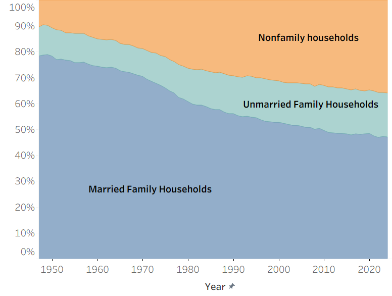
The Evolving Shape of the American Household

October 7, 2025 Chase 0

Explore how American household types have shifted since the 1940s using data. See trends in married, unmarried, and nonfamily households.
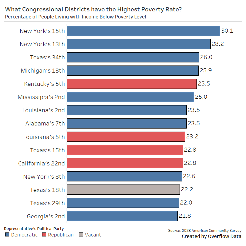
Where Poverty Rates Are Highest: A Look at U.S. Congressional Districts

July 8, 2025 Chase 0

New Census data shows a striking divide in poverty rates across congressional districts and who represents them. Topping the list: New York’s 15th Congressional District, […]

Posts pagination

« 1 2 3 … 50 »

Categories

Copyright © 2026 | WordPress Theme by MH Themes