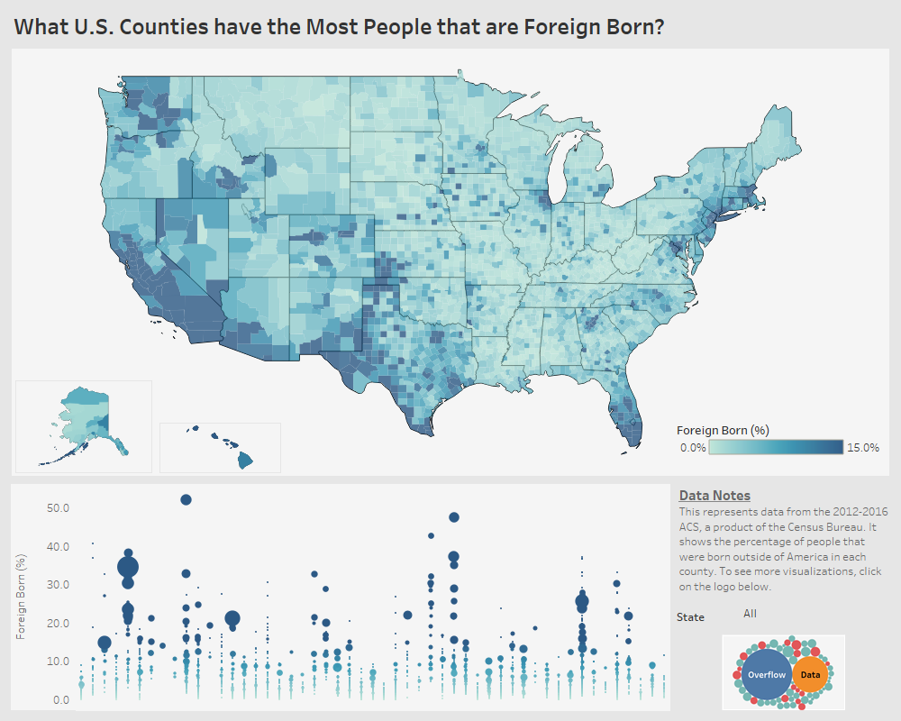
What U.S. Counties have the Most People that are Foreign Born?
This visualization shows the percentage of the population that was born in another country in each U.S. county.
This visualization shows the percentage of the population that was born in another country in each U.S. county.
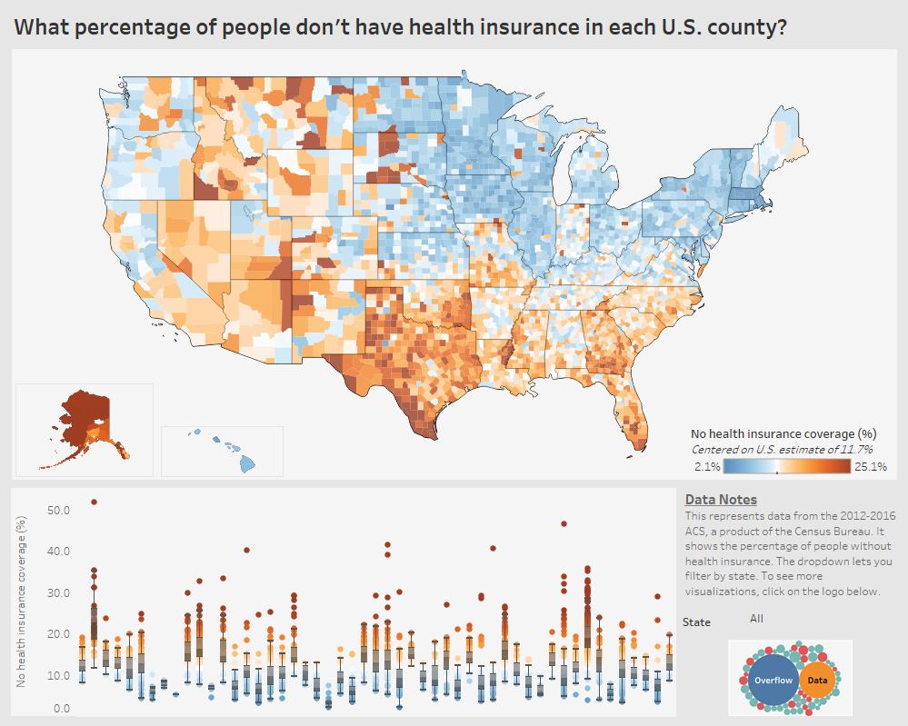
A data visualization looking at how the percentage of people without health insurance differs in each U.S. county.
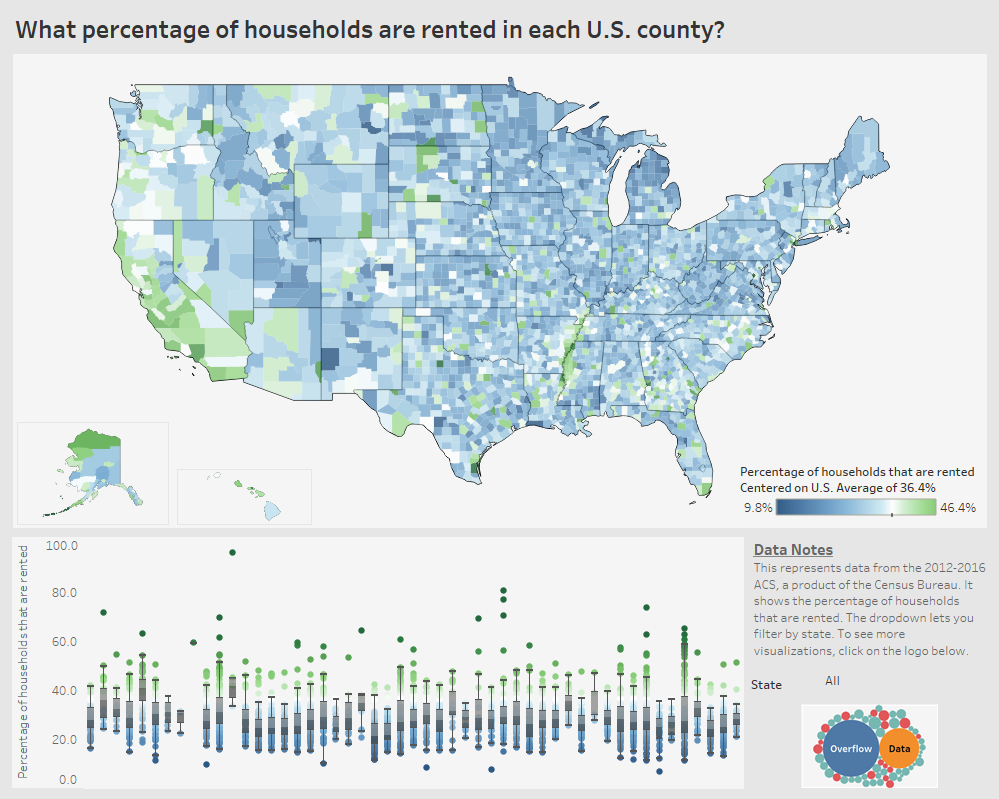
A visualization of the percentage of households in each county in the United States that are rented.
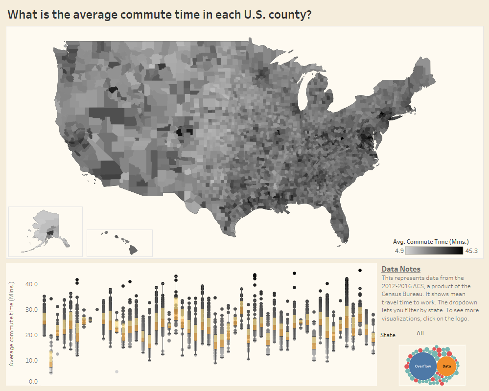
A look at what counties had the longest commute in the United States using 2016 American Community Survey data from the U.S. Census Bureau.
Copyright © 2026 | WordPress Theme by MH Themes