Aging in America: State-by-State Analysis of Aging Population
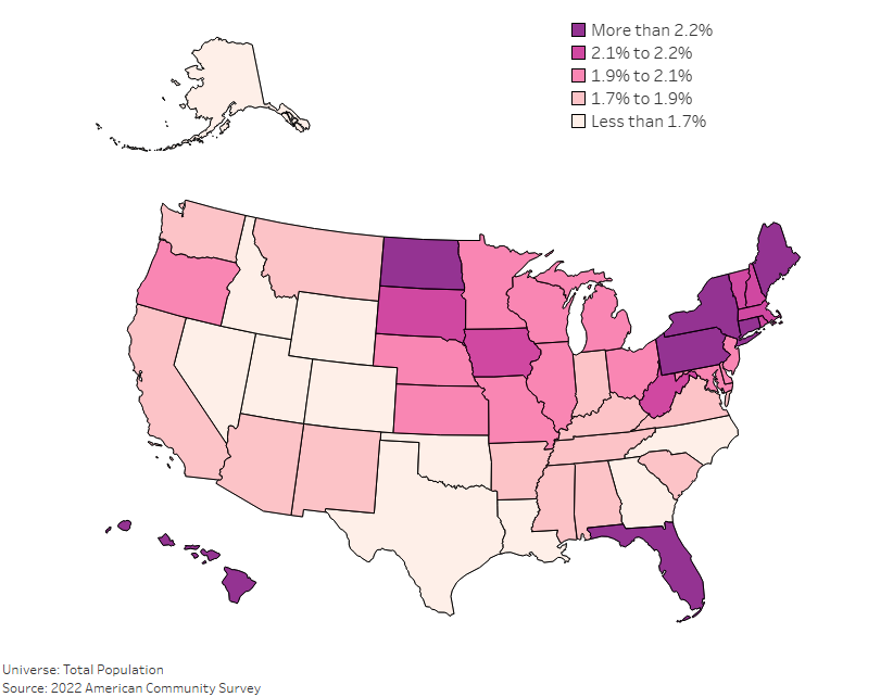
As America continues to shift demographically, the aging population has become a much larger focus for policy makers. Understanding where the oldest Americans live, and […]
As America continues to shift demographically, the aging population has become a much larger focus for policy makers. Understanding where the oldest Americans live, and […]
Copyright © 2026 | WordPress Theme by MH Themes