
Overflow Data

A data visualization portfolio for the world.

  • Home
  • State Data Explorer
  • County Data Explorer
  • County Level Analysis
  • Politics
  • About Us

Month: June 2016

No Image

Regression Statistics for “Did the % of Party Affiliation by County in California Have an Effect on the % of the Vote each Candidate Won?”

June 9, 2016 Chase 0

Regression Statistics forĀ “Did the % of Party Affiliation by County in California Have an Effect on the % of the Vote each Candidate Won?” A […]
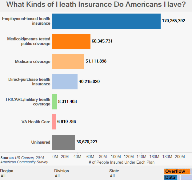
What Kinds of Heath Insurance Do Americans Have?

June 8, 2016 Chase 0

Health Insurance has undergone huge reforms over the last decade. This visual shows how many people are signed up for each type of insurance.

What Kinds of Heath Insurance Do Americans Have? – Mobile

June 8, 2016 Chase 0

Visualization Data Notes The data for this visualization comes from the American Community Survey which is conducted by the US Census Bureau. The data was […]

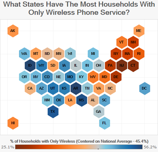
What States Have The Most Households With Only Wireless Phone Service?

June 7, 2016 Chase 0

The CDC tracks home phone service and estimated that at the end of 2014, 45.4% of households only have Wireless phone service. These visualizations show the percentage by state.

Posts pagination

« 1 2 3 4 »

Categories

Copyright © 2026 | WordPress Theme by MH Themes