Overflow Data

A data visualization portfolio for the world.

  • Home
  • State Data Explorer
  • County Data Explorer
  • County Level Analysis
  • Politics
  • About Us

Special Projects

A U.S. hex map showing the percentage of households receiving SNAP or food stamp benefits by congressional district. Dark red districts have 20% or more households receiving benefits, while yellow areas have less than 5%. Nationwide, 11.8% of households—about 15.6 million—receive SNAP assistance. High-dependency districts cluster in the rural South, parts of the Midwest, and major urban centers, while lower rates appear across much of the Midwest and Mountain West. Data come from the 2024 American Community Survey.

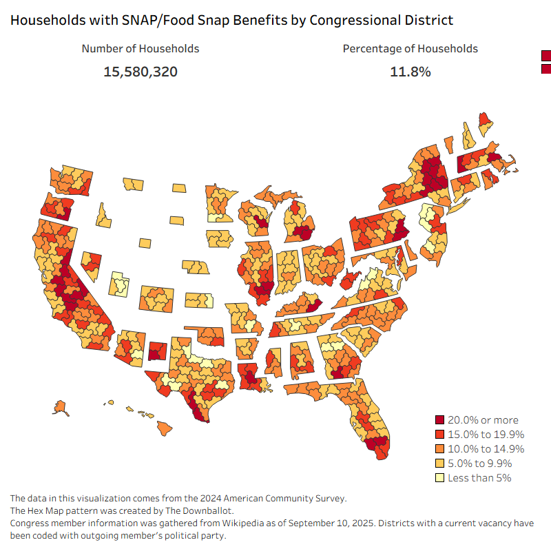
How Reliant Are America’s Congressional Districts on SNAP?

October 28, 2025 Chase 0

Explore how many U.S. households rely on SNAP in each congressional district and see who may be affected by the 2025 government shutdown.

Breaking Down Voter Turnout in the 2024 Presidential Election

September 22, 2025 Chase 0

This visualization uses data from the U.S. Census Bureau’s Current Population Survey, 2024 Voting Supplement. It highlights how voting patterns vary across different demographic characteristics. […]

U.S. Military Deaths Since 2001

May 27, 2024 Chase 0

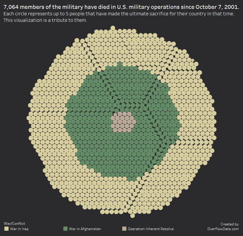
This Memorial Day, we wanted to honor those that have paid the ultimate sacrifice. To do that, we created this visualization. It pays tribute to […]

What States Have the Most Adults Attending Church Once a Month?

April 27, 2024 Chase 1

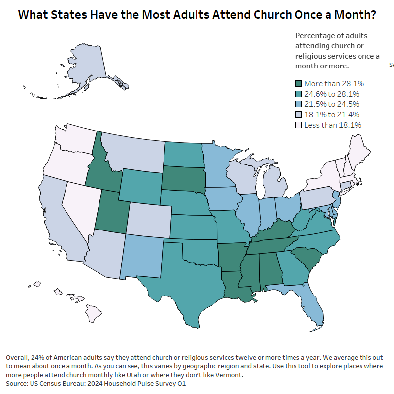
In Q1 of 2024, 24% of adults attended church monthly in the US. This tool shows how that varies state. States such as Utah lead the way.

Posts pagination

« 1 2 3 … 31 »

Categories

Copyright © 2026 | WordPress Theme by MH Themes