
Visualization
Data Notes
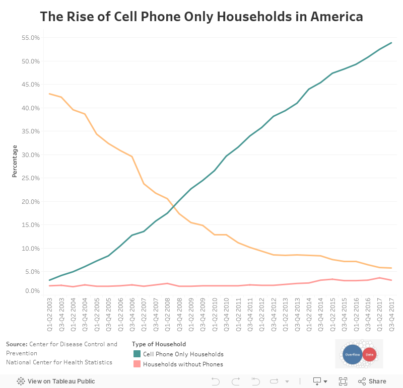
The data for this visualization comes from the National Center for Health Statistics which is managed by the Center for Disease Control and Prevention. I gathered data from multiple PDF reports to compile this data set. Once I gathered the data, I used Tableau to create this visualization.
It should also be noted that the percentages don’t add to 100%. The data for households with both or which wireless status couldn’t be determined wasn’t included because of a methodological change in 2007.
If you want to keep up with our surveys and data analysis, be sure to follow us on Twitter and Facebook.
The Rise of Cell Phone Only Households in America #dataviz https://t.co/OK0oZdvMkE pic.twitter.com/8xUjrrg2UH
— Overflow Data (@overflow_data) August 26, 2018
Leave a Reply