Our Most Popular Visualizations of 2016
2016 was another great year for Overflow Data. To celebrate we have compiled a list of our 5 most popular data visualizations from the past year.
2016 was another great year for Overflow Data. To celebrate we have compiled a list of our 5 most popular data visualizations from the past year.
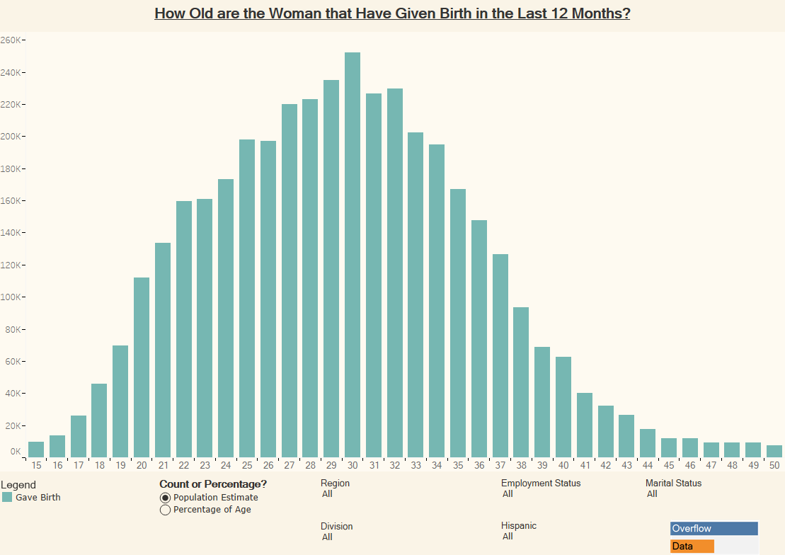
This interactive visualization lets you see how many women gave birth in the last 12 months charted by their age. There are also various filters that let you see how it differs in different circumstances.
This interactive visualization lets you see how many women gave birth in the last 12 months charted by their age. There are also various filters that let you see how it differs in different circumstances.
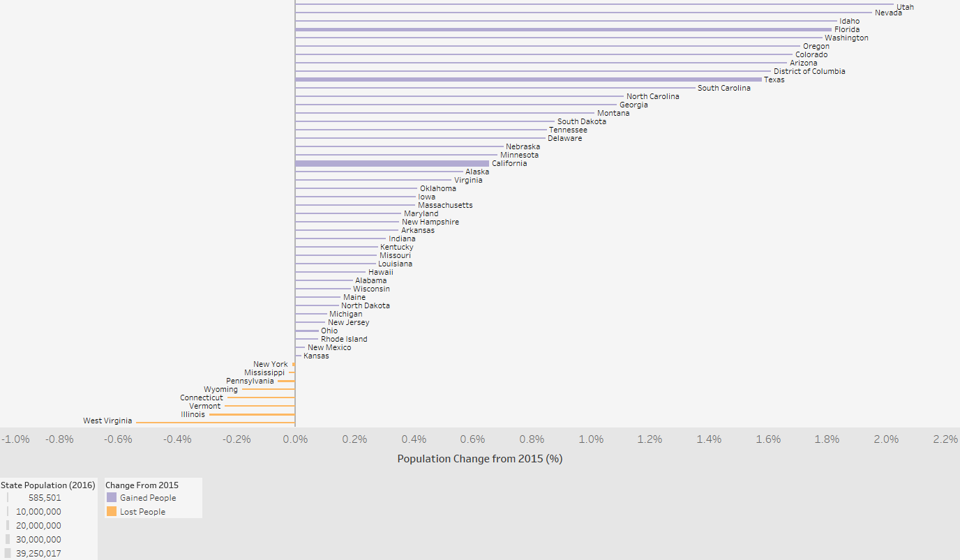
A look at population growth for each State between 2015 and 2016.
Copyright © 2026 | WordPress Theme by MH Themes